/ USE CASE
Lucky Financial
/ Problem to solve
Transforming offer experience into seamless digital banking app
Initially, Lucky was designed as an offers and discounts platform use by our customers to get savings. The goal of this project was to transition this platform into a digital banking app where the jobs-to-be-done were opening a bank account to do debit and credit transactions. This transition would involve rethinking the app's features, user interface, and overall user experience to align with the new focus on digital banking.
Insights
+3 Millions
Active users
90%
C1 and C2
85%
of lucky users are unbanked and transact only in cash
71%
of Lucky users would apply to a debit card if lucky offered it
56%
of Lucky users are interested in a credit product
Business goals
“Lucky should be the most seamless and economical way to pay and buy”
Highest merchant-backed rewards & discounts on every purchase
Instant online approval and easy to use from the phone or with the card
“Create the most accessible credit facility in the market”
Most effortless and fastest approval process in the market
The largest merchant acceptance network
Benchmark findings
Instant Balances
See your main account balances right on the home screen.
Easy Navigation
Use the bottom bar to move between main sections effortlessly.
Clear Guidance
Banners help you find and take important actions.
Organized Information
Content is neatly divided into sections using boxes for easy browsing.
Seamless online application
Debit and credit card request online with identity verification. Instant approval.


* apps benchmarked
Ideation
Facts
96% find it easy to group sections.
100% of users grouped cards as an isolated section.
83% of users grouped making a payment along with actions such as:
Sending money to a friend.
Buying or paying in installments.
Financial activity is treated separately.
How might we...
Clarify that Lucky is a bank.
Distinguish financial activity from offer redemption.
Integrate financial activity with the shopping experience.
Simplify the process of making payments online.
Ideas
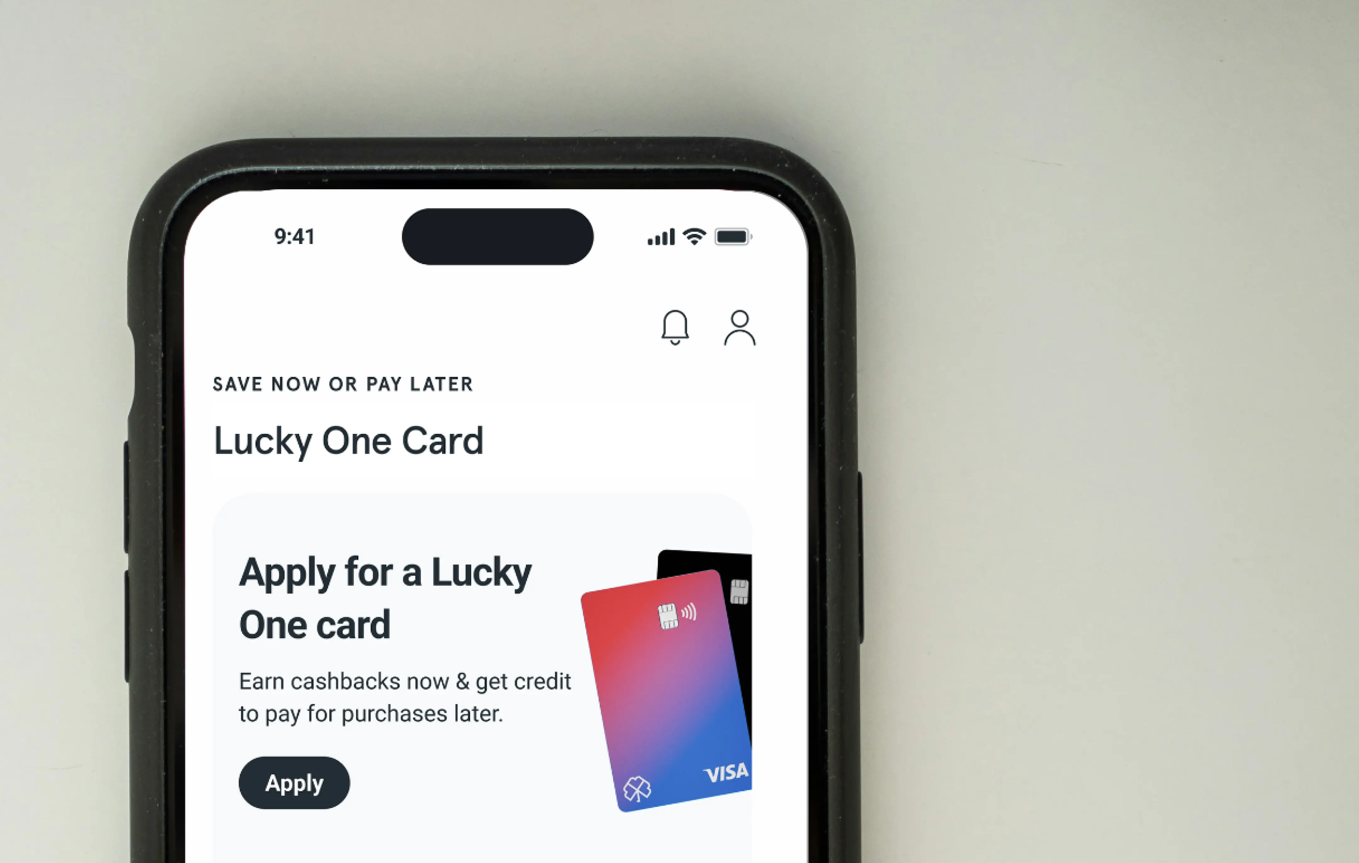
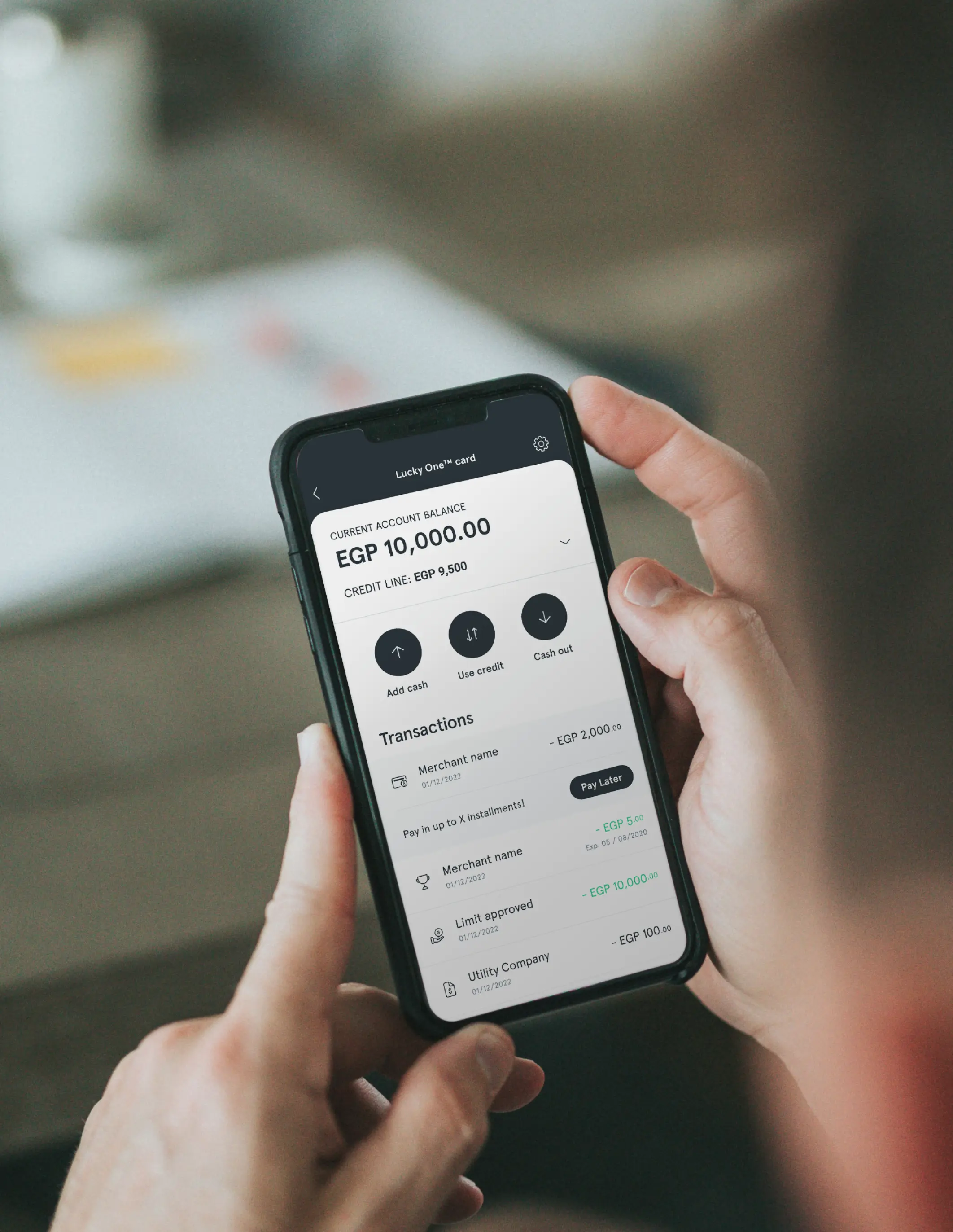
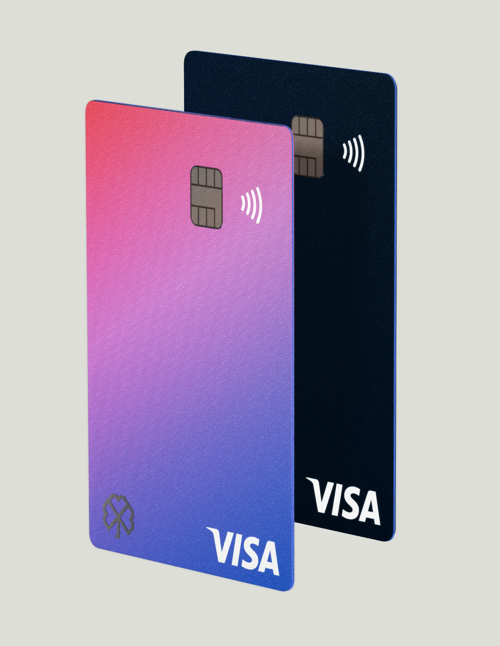
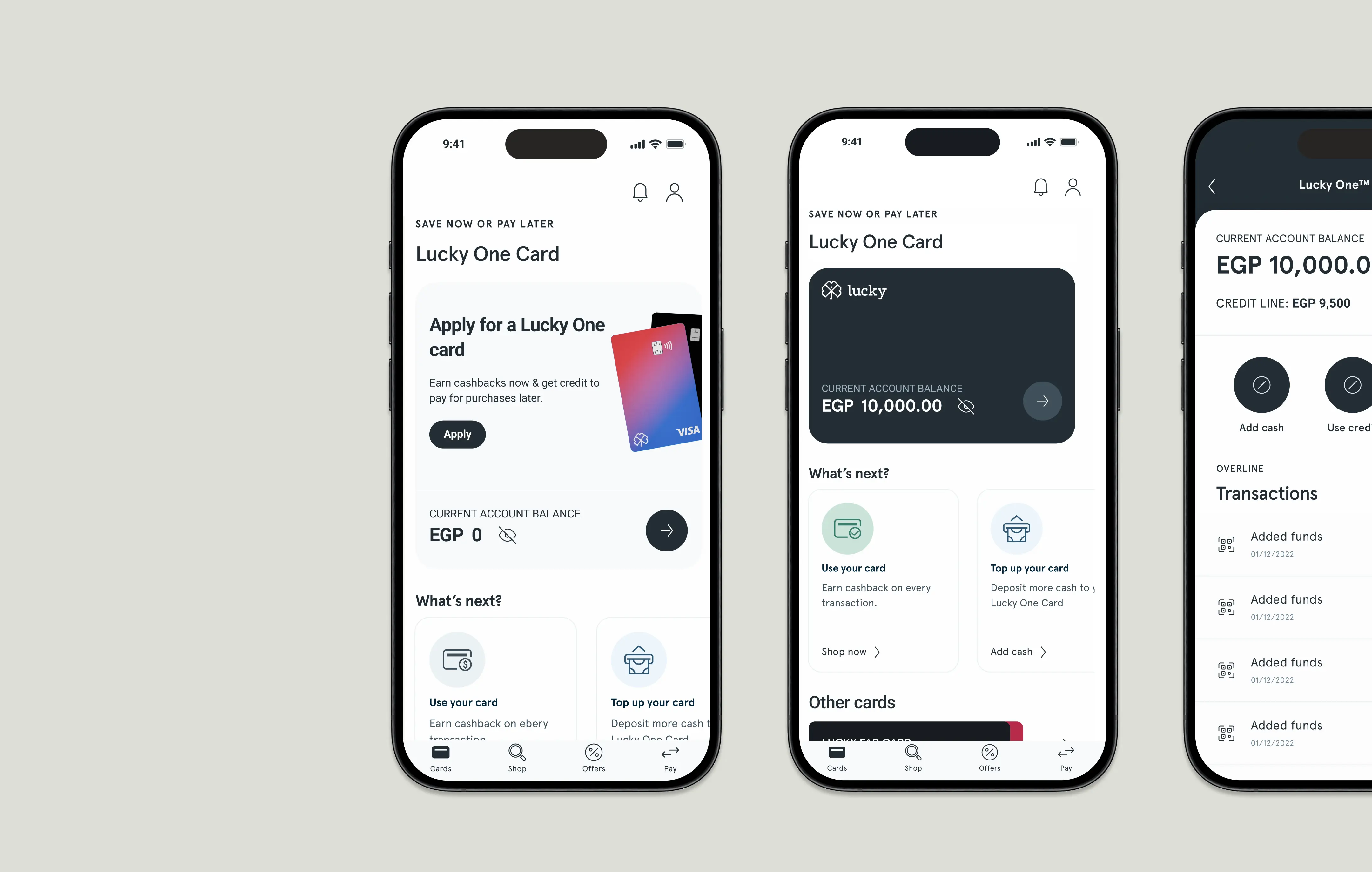
Design a new app structure, focused on the main business goal: applying for a debit card.
Utilize a "What's Next" feature to encourage card usage.
Implement a first-level navigation that allows users to find the main tasks at a glance.

* NEW APP STRUCTURE AND NAVIGATION
/ aftermath
Impact & results
registered users
daily cards issued
monthly users
cards issued
merchants integrated
Testimonials
Perfect application and easy to use
RanaH.
Amazing app and now with their card it’s even better. thanks
BlueA2
This app very useful I think everyone should try this app
Yousefyoya
Main challenges
Cultural barriers
Certain standard banking practices and terminology needed to be changed to align with local customs and religion.
E.g. a segment of orthodox muslims believe taking credit is against religion and don’t encourage women financial independence
Segmented user testing
We internally user tested the app and specifically targeted orthodox muslims to define pain points and adjust the app
Language barriers
As main user segment speak only Arabic understanding user emotions and thoughts was challenging during user testing.
Live Translations
We conducted user testings over zoom with a live-speaking translator and we intervened when needed to do relevant follow up questions
